Eke-marin
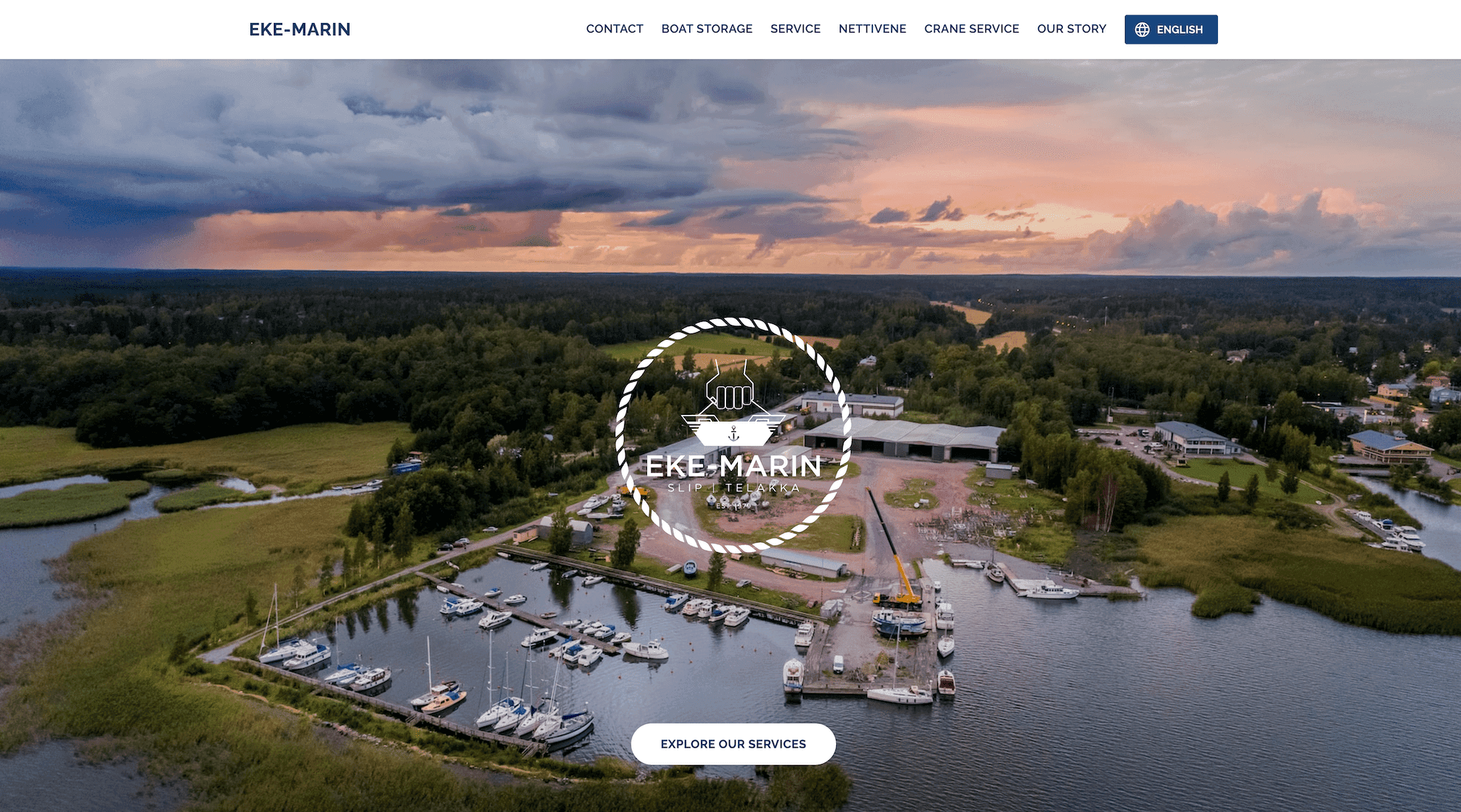
Website renewal for Eke-marin. A comprehensive boat docking, storage, maintenance and crane lifting service business.

Boosting Online Visibility: A Boat & Crane Service Website Revamp
A longstanding comprehensive boat docking, storage, and maintenance business, faced significant digital hurdles. The previous website, while reflecting the company's rich history, had become increasingly dated in both appearance and functionality. It struggled with lower performance in key online metrics, such as search engine optimization (SEO), which significantly limited its visibility in online searches. This issue somewhat hindered the attraction of new customers, in spite of the strong and steadfast support from the existing client base.
The primary goal of the website renewal was straightforward yet profound: boost marketing outreach and drive customer engagement, culminating in increased sales. To achieve this, the website needed not only to provide information but to serve as an inviting portal for potential clients to establish contact and avail the business's services.
Process & Strategy
Understanding the Business: While I was given considerable creative freedom in the design and development of the site, it was essential to prioritize and highlight the company's core offerings. This profound understanding became the bedrock upon which the revamped site was built, ensuring the primary services were effectively showcased.
Design Considerations: Rather than reinventing the wheel, the focus was kept on clarity. Adhering to the brand's existing colors and style ensured consistency and immediate brand recognition.
Integrations & Features: One of the standout features was the inclusion of three custom contact forms, tailored for distinct use cases. The Crane Booking Form, Storage Booking Form, and General Contact Form. Each form was meticulously designed to capture specific information, showcasing the site's versatility in addressing varied client needs and streamlining operations.
Results
The website renewal led to tangible positive outcomes for the business. There was a noticeable increase in the website's web traffic. The refreshed design not only brought the business's digital presence up-to-date but also resonated with visitors, fostering a sense of trust and professionalism. While there’s always room for growth and learning, the initial feedback suggests that the revamped website aligns well with the company's vision and the needs of its clients.
Conclusion
This project underscores the importance of a well-structured, clear, and user-friendly website in enhancing a business's digital footprint. By simply aligning the site's design with the company's core services and brand identity, and adding straightforward features like a contact form, businesses can significantly enhance their online engagement and drive growth.